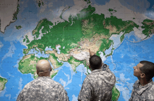
Source: The Washington Post
Greenland is the biggest mirage in geography. Look at almost any world map, and Greenland appears to rival Africa in size, when in reality Africa is roughly fourteen times larger.
The projection responsible for this error was designed by Gerardus Mercator in 1569 for maritime trade: a straight line on his map held a constant compass direction allowing sailors to plot an ocean crossing without correcting their bearing along the way. That accuracy came at a cost, since the area becomes increasingly distorted with distance from the equator, enlarging Greenland and northern Europe while compressing the continents in between.
To this day, Mercator remains the default across classrooms, media and official materials. On September 4th 2026, the United Nations General Assembly voted 164 to one to pass the “Correct the map” resolution led by Togo and the African Union. This resolution encourages governments, schools and technology companies to adopt equal-area mapping, arguing that the distortion has contributed to the “symbolic minimization” of Africa. The resolution is non-binding and imposes no compulsory replacement, which leaves the question of whether redrawing a continent changes anything about how it is perceived.
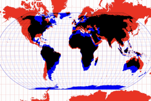
Figure 1: A colour-coded look at where Mercator distorts; inflating in red, shrinking in blue.
Source: ABC News
Not Wrong, Just Misused: Why Mercator Distorts the World
Calling the Mercator projection a lie overstates what it does. Mercator is conformal, meaning that shapes are preserved while actual sizes are distorted. In contrast, the Equal Earth projection is an equal-area map that reverses the bargain, showing true relative sizes of countries and continents while distorting their shapes. Neither one is wrong. There are more than 200 major world projections, each warping the Earth differently, making the choice a matter of context rather than an objective default. The resolution passed in September acknowledges this directly, noting that no projection can reproduce a curved surface on a plane without sacrificing area, shape, distance or direction . Mercator’s real problem is a mismatch between what it was built for and what it is used for.
The Mercator projection was designed for colonial exploration and maritime trade, and over the centuries it became an all-purpose map for governments, educators and companies.
Tom Patterson, one of the cartographers behind Equal Earth, told NPR that the old map was extremely useful during the age of exploration and European colonialism, and that it almost became the de facto world map.
However, the projection was not the only thing shaping how Africa appeared. European map-makers filled the continent with trade routes, resources and blank spaces ready for development, while disregarding the mapping traditions and geographic knowledge of Africans already living there. The Berlin Conference of 1885, where European powers partitioned Africa without a single African delegate present, was that practice at its most extreme.
For the African Union, the argument over projections is about dignity and autonomy as much as cartographic accuracy.
The distortion still shapes how people think. Patterson argues that students taught from a Mercator world map end up with a completely warped view of how large countries are . Geographers Jack Swab and Derek H. Alderman went further, suggesting that Donald Trump’s interest in buying Greenland, which he justified by pointing to its size, was likely influenced by map distortion.
The difficulty lies in the fact that Mercator is not wrong. Every projection trades one kind of accuracy for another, so choosing Equal Earth means preferring true area over shape. The preference of which projection to use lies in the purpose. Hardly anyone plots a compass bearing on a world map now, while millions take their sense of scale from one, which is something Mercator was never built for. In short, a map made for sailors became a map used by everyone.
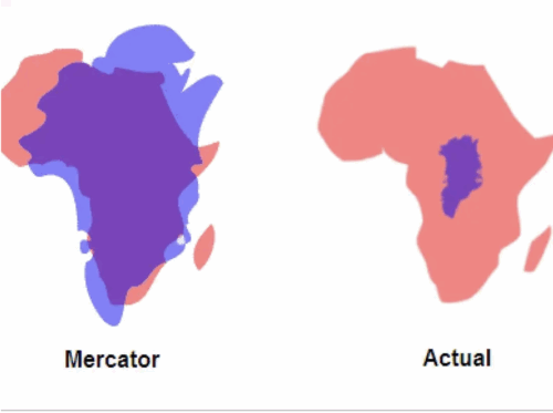
Figure 2: Africa and Greenland to scale
Source: Business Insider
One Vote, One Objector: The Politics Behind 164–1
The UN’s non-binding resolution to ‘correct the map’ almost passed unanimously, with 164 countries in favour, six abstaining and only one against. The one no came from the United States, which has a contentious history with voting in UN resolutions, including voting against a resolution recognising food as a human right, opposing the recognition of the transatlantic slave trade as the ‘gravest crime against humanity’,and using its veto power to prevent Palestine from full UN membership, but historically has still carried significant diplomatic influence.
Within the UN there are two main bodies: the General Assembly (UNGA) and the Security Council (UNSC). The UNSC passes legally binding resolutions for all member states. The council has 15 members, consisting of five permanent members (China, France, Russia, the United Kingdom, and the United States) known as the P5, who also hold veto power and ten non-permanent rotating members who serve for two years with non-consecutive terms. The UNGA pass non-binding legal recommendations, and all member states can participate; to pass a resolution, it requires a majority yes vote and operates under the system of ‘one country, one vote. The ‘correct the map’ resolution passed through the UNGA, where the US had no veto power but still, at least in the past, holds significant influential authority.
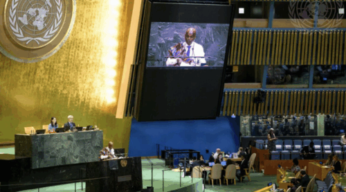
Figure 3: Togo addresses the General Assembly before the vote.
Source: United Nations
The United States representative Yaryna Ferencevych claimed the resolution was ‘superfluous’ and distracted from genuine issues requiring attention from the UN. In their statement they claim their opposition is due to the push of a ‘radical ideological project’ in their mission to ‘[promote] reparations and cognitive justice’ through the equal earth map. This coincides with the United States’ larger rhetoric in denying systemic forms of injustice and modern consequences of colonialism, as they previously opposed another UN resolution to recognise the legacies of colonialism. However, this does not align with their ongoing decisions to alter their maps and territories, such as renaming the Gulf of Mexico to the Gulf of America, or more recently changing Lake Ontario to Lake America, indicating what is on a map may in fact impact the perceived power and importance of that region.
This decision from the US reflects their reactionary policies, which are seeking to counter what they consider the dominant “radical” ideology. What is subversive is the widespread acceptance of this map in almost every nation. Africa is a growing hub of resource exports and political influence, with major powers such as China implementing zero-tariff policies to all 53 nations on the continent. Many theorists predict we are entering a ‘New scramble for Africa’, this time based on soft power and international trade, wherein the acceptance of the Equal Earth map literally embodies Africa’s growing political visibility. This may also put into question whether the United States’ unilateralist decision will leave it behind in a volatile global stage.
Does a New Map Change Anything?
Maps are more than just representations of geography. The way the world is shown can shape how people picture it in their minds. Research into ‘cognitive maps’ suggests that the projections people are exposed to can influence how they understand the relative size of countries and continents, particularly when a single version becomes familiar over time. This can go beyond physical size since the way countries are visually emphasised may also affect how important or prominent they seem. This idea sits at the centre of the current UN debate. Supporters of the Equal Earth projection argue that repeatedly showing Africa as smaller than it really is can have symbolic consequences for how the continent is perceived. Togo’s Foreign Minister Robert Dussey has made a similar argument that changing the map can help create a fairer global perception of Africa.
So what does changing the projection actually achieve? The clearest effect is that the relative size of countries and continents is shown more accurately. Africa and Greenland are a clear example of this. On a Mercator map, Greenland appears to be relatively the same size as Africa, even though Africa is approximately 14 times larger. Equal Earth reduces this distortion, making regions closer to the equator appear more proportionate compared with places such as Europe, Russia and North America. The UN has therefore presented the change as a way of improving the accuracy of world maps, while Dussey has argued that it gives Africa a fairer and more accurate visual representation.
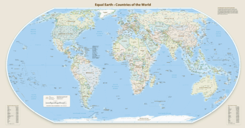
Figure 4: One map, every country at its true size.
Source: ABC News
However, the immediate practical impact of the decision is likely to be fairly limited. The UN resolution is not legally binding, meaning that governments, schools and organisations are not required to use the Equal Earth map. In Australia for example, the national curriculum does not require schools to use any particular world-map projection. Furthermore, many people already have a deeply ingrained mental image of the Mercator world map after having seen it for most of their lives. Consequently, this shift in UN practice is unlikely to suddenly change how people see the world. Its bigger impact may instead come over time, especially if schools and other institutions begin using equal-area maps more often.
Finally, there is a limit to how far the idea of ‘correcting’ the map can be taken. No flat map can represent a three-dimensional globe perfectly, so every projection involves some kind of distortion. The Mercator projection is not simply ‘wrong’ – it was designed to depict angles and directions for navigation. Equal Earth instead prioritises relative area, but it still distorts shape, distance and direction. So the UN’s decision should not be seen as replacing a wrong map with a correct one, its main value lies in making people more aware that every map involves trade-offs, and that different projections are useful for different purposes.
The UN’s push toward equal-area mapping is unlikely to transform global perceptions of Africa overnight, but that does not make the change meaningless. The Mercator projection is not inherently wrong – it was designed for navigation and remains useful for that purpose. The problem is that it became the default way of seeing the world, despite distorting the relative size of continents. Equal Earth therefore offers a more appropriate alternative when the goal is to compare relative area, whilst also challenging long-held perceptions about the size and prominence of different regions. Ultimately, the debate is less about finding a perfectly “correct” map and more about recognising that maps shape perception. Changing the projection may be symbolic, but over time that symbolism can influence how future generations understand Africa’s scale and place within the wider world.
The CAINZ Digest is published by CAINZ, a student society affiliated with the Faculty of Business at the University of Melbourne. Opinions published are not necessarily those of the publishers, printers or editors. CAINZ and the University of Melbourne do not accept any responsibility for the accuracy of information contained in the publication.